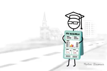
Imagine this: research conference organizers send the participants a PowerPoint presentation slide template along with instructions that sound something like this:
Your presentation should be 20 minutes long; please keep the number of presentation slides to a maximum of 20.
A scientist who has 35 PowerPoint slides from the previous conference and might think:
OK, no problem! I will simply squeeze the information from the remaining fifteen slides into the first twenty to fit the provided presentation template.
The resulting presentation slides probably look similar to the figure below.
The scientist arrives at the conference, delivers the presentation, and receives applause at the end. He puts a picture from the conference on a social network and receives a comment: Sorry, I missed your presentation. Please email me the slides.
Ahh, he thinks, it’s a good thing I jammed that extra information into the presentation slides. Otherwise, it would be difficult for the person asking to get the full overview of my work!
It seems everyone is happy. The conference organizers got their 20 slides, the presenter successfully delivered his speech, and even the person on social media got the information she requested. But one thing is missing from the story – what about the people who actually showed up for the presentation?
The listeners were probably bewildered by the PowerPoint slides resembling an explosion of a hard drive disc over the screen. Their eyes were darting to follow the laser pointer from a figure in one corner of the slide to bullet points in the other. At around the third slide, many probably started daydreaming about the appetizers they can expect during the coffee break. They energetically clapped their hands at the end of the presentation because it was finally over. They forgot the performance as soon as the next speaker took the stage.
OK, but what about the person that asked you to send her the slides? Surely she would be disappointed when receiving a presentation which she cannot understand without you being there to present it. Well, send her the research paper (see my book to learn writing an impactful research paper). This is the piece of work that is meant for sharing and has to be self-explanatory. You are on the stage for a reason! Research conference presentation slides do not have to be self-explanatory.
In this post, you will learn three crucial tips for preparing scientific conference presentation slides to efficiently explain your research.
Tip No.1: One thought per slide
Presenters often use slides to keep the talk on track. Frequently this takes the form of the dreaded bullet-point list. Such an approach is a bad idea. Despite what some people claim, humans can not multitask at things that require deliberate thinking. Too much text will draw the listener’s attention away from what you are saying and toward reading the text on the slide. Since we read faster than we can speak, your listeners will already know what you are going to say, thus losing their attention.
The best approach for keeping the presentation slides light is to limit yourself to one single thought per slide. This could be, for example, a figure and several supporting bullet points taking up not more than one row each. But do not be afraid only to have one item, like a diagram, on the slide which takes only ten seconds to explain. There is no invisible jar that will start to spill over if you pour too many slides inside. A single thought per slide will allow the audience to better follow the presentation. This will also allow you to increase the size of text and images, thus ensuring that people in the back row can follow the talk.
Instead of using presentation slides as a teleprompter, use this valuable real estate for information that adds to your presentation, not duplicates it.
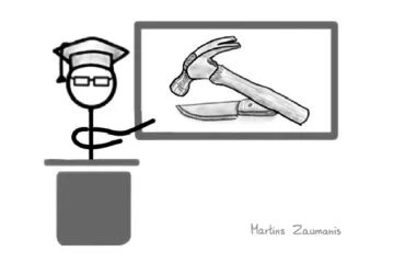
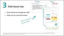
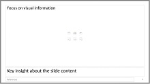
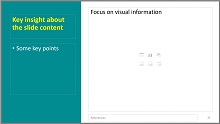
The “before” figure below presents a typical academic conference PowerPint presentation slide with three bullet points. I transformed it into three separate slides, each introducing one single thought. When displaying the “after” slides, the presenter would simply say out loud the information that was previously written.
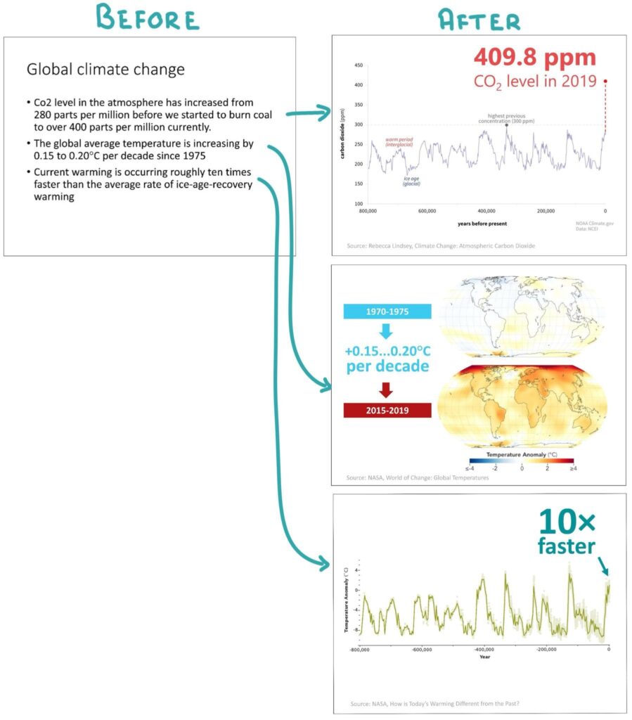
You will notice that each of the converted slides uses visual information instead of text. Visuals draw human attention and can do a great job explaining things that would be difficult to put into words. Data charts, scientific illustrations, diagrams, or videos can all add another dimension to complement your presentation.
I am not claiming that you should strip your presentation slides of useful information or dumb them down. My reasoning stems from the vast majority of presentation slides that I have seen in research conferences. The slides are often overwhelmed with details that do more to confuse the listener than help. Focusing the slide content on visual information will help to support instead of distracting from your message. This brings us to the next topic.
Tip No.2: Presentation slides are for visual information
Even though I urge you to simplify the slides, it is clear that as a researcher, you will need to present complex information. This will most often take the form of different charts and illustrations (let’s call them graphics).
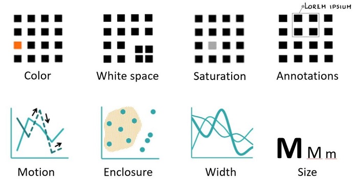
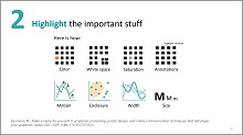
There is a lot to learn about the creation of graphics, but one element from the toolkit of designing graphics is particularly important for creating great scientific conference presentation slides. That is knowing how to guide the listeners’ attention. To do it, we must tap into a basic human instinct – people are drawn to outliers. Back at the dawn of homo-sapiens, this helped us spot danger or notice prey: think of a lion moving in a steppe – it is easy to imagine why our vision has evolved to pay attention to it.
Today we can take advantage of the 300 thousand-year-old instincts of our species to explain the all-important differences between two lines in a graph. Color, size, motion, white space, enclosure, and shape are some graphical features that can attract attention to particular elements in a chart.
Learn creating charts that tell a story
Knowing how to prepare efficient data charts and graphics will not only help you to create better slides; you will be able to use these skills to write clearer research papers and certainly it will increase your chances of obtaining research grants. My book Research Data Visualization and Scientific Graphics is a short guide that will help you to learn create charts that tell a story.
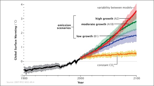
The example below directs the attention of the viewers within a single chart to the different topics that are being discussed (data from Evans et al.). These could be presented in sequential slides.
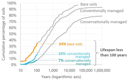
The “Only 60 harvests” left claims are exaggerated. Research by Evans et al. shows that depending on the soil management, only 7-34% of soils have less than 100 year lifespan.
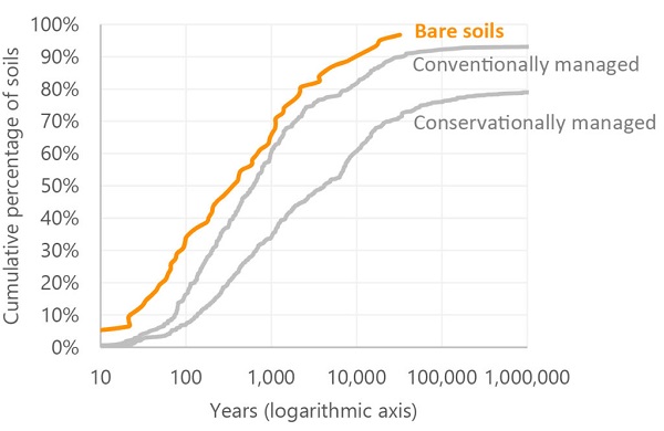
Even most bare soils survive upwards of 300 years.
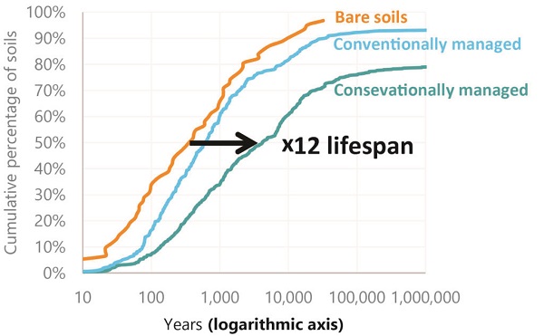
A good management practice can extend the soil’s life by several orders of magnitude.
A word of caution for those who might become too trigger-happy when discovering how easy it is to add animations to PowerPoint presentation slides: use these effects only when they add information to the story that you are telling. It quickly becomes irritating to see flying text, rotating slide transitions, expanding bullet points, and dissolving pictures. Revealing only one item at a time can be similarly annoying when done without a purpose.
Hint: Avoid using PowerPoint templates with busy backgrounds or colorful university logos on each slide. This limits your ability to draw the listeners’ attention to a particular item on the slide. On a busy background, the highlighted parts will not pop out quite as much as they would from a simple background.
Tip No.3: Use action titles
Instinctively we can probably agree that the most important information, regardless of the type of medium, should be the largest. For example, it would be weird if the largest letters on a milk bottle would rea “Recyclable”. Interestingly, almost none of us actually follow this logic when designing scientific conference presentation slides.
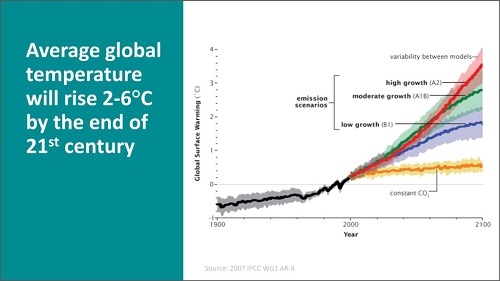
If you open PowerPoint, by default the largest text is the slide title. Since it is also located at the top of the slide, the title is going to be the first thing that draws the listener’s attention. But what do we put up there? Redundant, meaningless phrases like Methodology or Results of XYZ test. The figure below provides one such example.
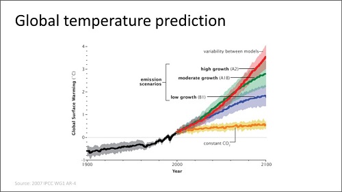
The traditional PowerPoint title attracts all the attention while providing very little information.
You will probably agree that the tile Global temperature prediction does little to reveal what’s important about the information in the presentation slide. That is unless the listener has suddenly awoken from a nap and wants to understand what is the topic you are currently discussing. If this is the case, slide titles are the least of your problems.
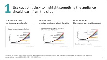
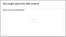
Instead of wasting the title for redundant information, a much better idea is to follow the advice from the C.N.Knaflic’s book Storytelling with Data in using an action title. An action title should provide information about the results, highlight an important observation or a conclusion for the particular slide. For example, instead of a whole block of slides having the title Results, the individual slide titles would say Observations have high variability or Simulation supports the test results.
In other words, a conference slide title should present something important about the research that the audience should not miss. It sets the expectations for what to expect from the information on the slide.
See below the different ways in which an action title can be displayed in the presentation slides. Doesn’t this approach offer more information than the traditional PowerPoint slide title that we saw earlier?
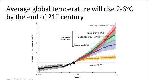
An action title highlights the key information that the listeners should not miss
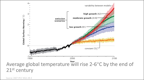
Placing the action title at the bottom (and graying it out) is another option, giving more emphasis to the slide content.
The widescreen (16:9) slide size can be put to good use by dividing it into two columns: one for visual information, the other for key text.
Removing the title altogether allows increasing the size of the graphics. The presenter tells all the information that was previously written in the slide title.

Font size rule of thumb: Make sure that the listeners in the back rows can read your slides comfortably. Since you will rarely have the chance to test this, apply the rule of thumb by using 14 to 28 pt. font size for the main text and in charts. References and other background information could be smaller and grayed out to avoid distracting from the main content.
A free scientific conference presentation slide template
Now that we have reviewed three key principles of academic conference presentation slide design, use them to prepare your own slides. An even better way is to prepare a PowerPoint slide template that automatically incorporates many of these tips.
Below you will find a free PowerPoint template that I designed specifically for scientific conference presentations. It holds six preformatted slide layouts which by default follow many of the academic conference slide design tips that we just went through, including the use of action titles, focus on visual information, and large enough font size. The presentation template also holds the three design tips to serve as a reminder from this post.
You will access these free Powerpoint scientific presentation slide templates in the download
Great slides will not mask poor presentation skills
Creating great presentation slides is certainly important in order to make a memorable academic presentation. But no amount of slide polishing will mask other potential problems, including lack of substance, unclear presentation structure, and a presenter who is so stressed their mouth feels like a desert.
What you need is to add presentation skills to your scientific skill tool belt. My name is Martins Zaumanis and with my online course “Scientific Presentations Masterclass” I will show you how to become a masterful presenter using a system that I developed, called the “Five S presenting pyramid”.
Learn to give powerful academic presentations and overcome stage fright using the Five-S pyramid.

The Five-S pyramid starts from the basics of putting together the presentation Substance (first S), advances to devising a presentation Structure (second S), shows how to put up a Show (third S), tell memorable Stories (fourth S), and finally, it will offer advice for how the Speaker (fifth S) can work on improving presentation skills, including dealing with stage fright.
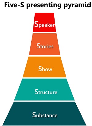
The Five-S pyramid starts from the basics of putting together the presentation Substance (first S), advances to devising a presentation Structure (second S), shows how to put up a Show (third S), tell memorable Stories (fourth S), and finally, it will offer advice for how the Speaker (fifth S) can work on improving presentation skills, including dealing with stage fright.
Author

Hey! My name is Martins Zaumanis and I am a materials scientist in Switzerland (Google Scholar). As the first person in my family with a PhD, I have first-hand experience of the challenges starting scientists face in academia. With this blog, I want to help young researchers succeed in academia. I call the blog “Peer Recognized”, because peer recognition is what lifts academic careers and pushes science forward.
Besides this blog, I have written the Peer Recognized book series and created the Peer Recognized Academy offering interactive online courses.