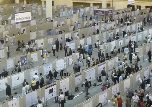
Poster sessions are the heart of scientific conferences. Here presenters meet the visitors, exchange ideas, and form new relationships. But this will happen only if the poster design attracts visitors’ attention and its content helps the author to explain the research. A good conference poster template will make your job in designing such a poster much easier.
In this article, you will find four different conference poster templates that you can download and use right away. To find out the advantages and disadvantages of each, keep reading this article. Hint: the design we have all used most of the time will be the wrong one.
After discussing the templates, I will share tools that make designing a poster more efficient and the result – better. Let’s dive in.
No.1: Traditional academic poster template
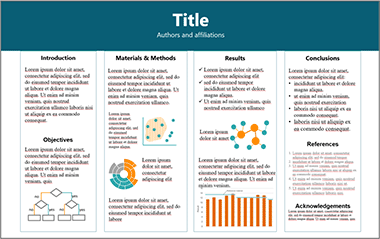
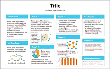
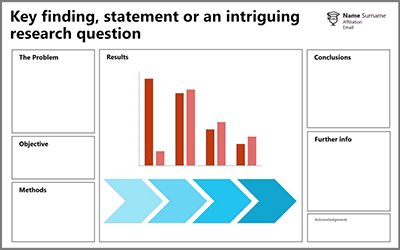
A traditional academic-style conference poster looks a lot like the one in figure below. Its sections closely resemble those of a research paper: Introduction, Materials and Methods, Results, Conclusions, References, and Acknowledgements. The boldest authors might have swapped the section titles for something more related to their research, but this will not disguise the general characteristics of this poster layout:
- The text is copy-pasted from the paper, often resembling a research paper stuck to a board.
- The figures require squinting even in close-up, not to mention reading them while passing by.
- Every square centimeter is filled with information
- The title reflects the topic of the study and does not say anything about the results.
- It is polluted with logos – the university, conference, etc.
You probably noticed that I have a certain dislike for the traditional style poster. I will offer better conference poster designs later in this article. But first, let me acknowledge that there are some situations when this type of layout can be useful:
- The layout is benificial when leaving the poster unattended since it allows the visitor to autonomously learn about the research. Such situations include permanent exhibition of research projects in a hallway or a website of a research project.
- The traditional posters arguably have a better chance to receive the best poster award – simply because of the amount of information that can be packed within it. The judges usually award the prizes based on the depth of the content rather a than visitor-friendly design.
- The traditional style poster can serve as a great summary of your research. Printed on a conventional paper (rather than on a poster) such a One Pager provides a condensed summary of your research for those who are not interested to read an entire paper but might spend 5 minutes to go over the key points. Cases where this could be useful include handing out to potential collaborators from the industry or to stakeholders.
- Finally, sticking to the traditional layout might be a wise choice when you expect conservative academics to judge you. For example, if the professor sent you a template for a graded poster session at the end of the course, you might just do as you’r told.
In most cases, including a conference poster session where the author is required to stand next to the poster, the traditional posted design is next to useless. Instead, use one of the three conference poster templates that I offer next.
You will access these traditional academic poster templates in the download
No.2: Presenter’s poster template
In a typical academic conference, most of the text that you have pasted on the poster is pointless. It would be an extremely socially awkward situation if the visitor would spend 10 minutes reading your poster while you silently observe this process. I can assure you that after 20 seconds one of you is going to budge and start a conversation.
A conversation is the whole point of a poster session – you, the presenter, want to interact with people. And the visitors want to hear from the author. This means that you can delete most of the text because you will be there to explain it orally.
Another pitfall of the traditional posters is the sheer amount of information they hold. The visitors can’t spend 20 minutes chatting to the presenter because they also need to browse the other 150 posters.
Actually you, the presenter, are also not interested in spending a lot of time with a single visitor because other potential guests, seeing that you are busy might simply pass by. This reduces your networking opportunities. Who knows – perhaps one of the people to whom you didn’t talk had a brilliant idea for a collaboration.
So there you go – most of the time neither the presenter nor the visitor are particularly interested in chatting for more than a couple of minutes. And yet, none of them knows how to politely get out of the conversation so it drags on.
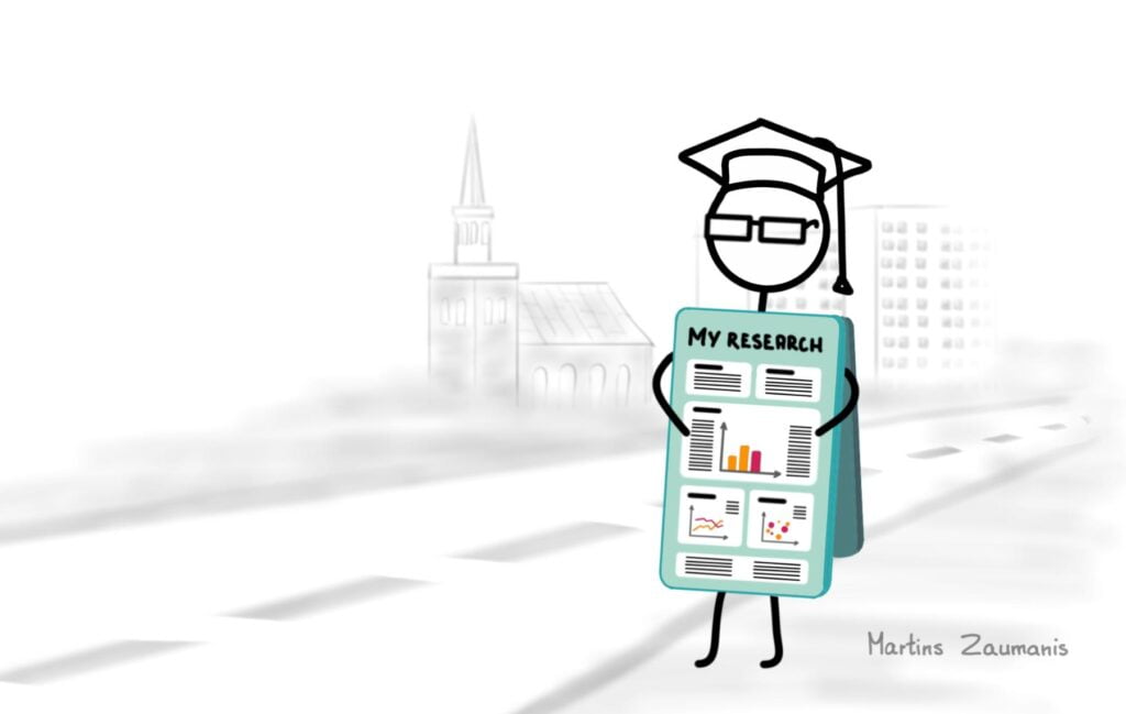
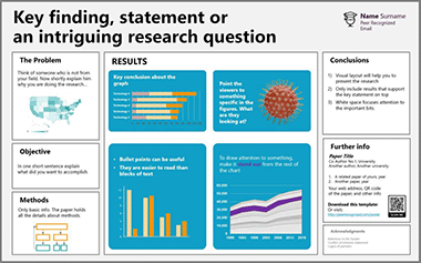
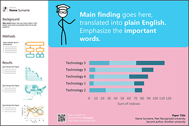
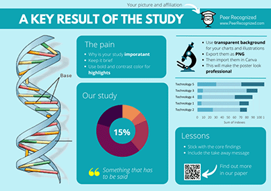
Now that we have identified the key problems with the typical academic poster, let’s take a fresh look at designing a more effective one. The figure below shows a conference poster template that I designed to help you intuitively apply the best poster design principles. Its main focus is on visual information – graphs, flow charts, and illustrations. Since this template is going to be used when the author is present to explain the content, let’s call it The Presenter’s Poster.
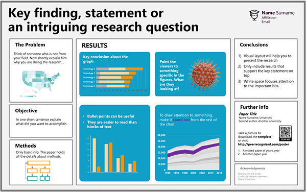
The template is simple enough to ensure that designing the poster will not take more of your time than creating the traditional poster.
When using the Presenter’s Poster template, focus on the most important results. If visitors want to dive into the details, hand out your full research paper or add a link on your poster for downloading it. Better yet, exchange contacts and agree to meet during the lunch break for an in-depth conversation. You can also exchange business cards and follow-up once you are back home.
Scrapping the excessive information from the poster is going to free up space on the poster. Now you can make the charts and illustrations large enough for people to see them without a magnifying glass. Not only will it facilitate discussions; larger figures are more likely to attract the interest of passers-by.
You will access these Presenter’s Poster templates in the download
A guide for poster design
My book Scientific Presentation Skills will explain what to include in each of the Presenter’s Poster sections to facilitate fruitful conversations.

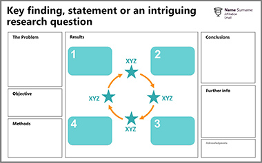
No.3: #betterposter template
“So, tell me about your poster”
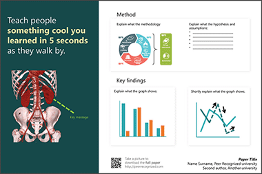
This is probably the most frequent opening when a visitor stops by a new poster. Mike Morrison, the originator of the #betterposter layout, thinks this alone shows the inability of the traditional poster design to convey anything meaningful about its content. If a glance at the poster would already answer this basic question, the visitor could approach the author with a more meaningful question thus making the conversation more efficient for both parties.
A peek at the poster should also signal the passer-by if he or she is even interested in a conversation. It is not worth chatting if either side will not benefit much and there are many other posters to visit.
The solution? Mike calls it #betterposter. See an example in the figure below.
You will notice that the first thing attracting attention in the design is the supersized text. This punchline is meant to summarize in plain English the take-home message of the poster. It allows the passers-by to quickly decide if they would like to get into more details. If they do, they can approach the author who then explains the research using the smaller bits of the poster. Mike Morrison puts it simply:
A poster that successfully communicates one thing is more effective than a poster that fails to communicate a thousand things.
When talking about the thousand things he is, of course, referring to the traditional academic poster.
You will access these #betterposter templates in the download
Best of all, Mike has created two videos that explain the pitfalls of the traditional poster and how the #betterposter can help make poster sessions better. Grab some popcorn, they are worth watching!
No.4: Infographic style poster template
At every scientific conference, there will most probably be at least one neatly designed poster resembling the example figure below. It will immediately attract the attention of passers-by. More eyes on you promise many more fruitful conversations during the conference.
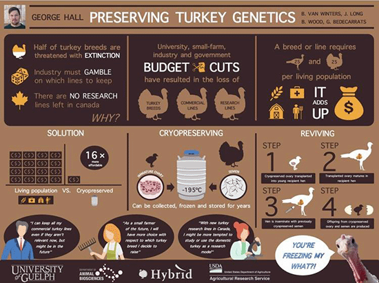
To create an infographic-style poster, you will have to come up with the design, create neat-looking graphics, care about the colors, and do many other things. This will take more work compared to the couple of hours you probably spent on creating the last poster. At the same time, the designing of one is less demanding than you probably think.
On http://peerrecognized.com/graphics you will help you see how to find useful graphics for illustrating a poster.
It is possible to design an infographic-style poster using PowerPoint, but a more specialized app will make it easier. One such tool is Canva, so I created this poster template using it. To use the tool, you will have to create a user profile but once this is done, the free version should serve your needs well enough.
You will access these infographic style poster templates in the download
A potential drawback of an infographic-style poster is that at some point it will fail to be scientific enough. For example, if you are attending a specialist research conference in your field, the visitors might want to see detailed charts, correlations, p-values, and jargon. Replacing these with pretty images, cartoons, and infographics might fail to leave an impression of you as a serious scientist. For this reason, before creating such a poster, consider the type of audience you will encounter.
Poster design software
Now that we have reviewed four radically different poster layouts, let’s look at some tools that will help create them.
PowerPoint is the No.1 used app for designing posters. For this reason, I made most of the templates using this tool. The familiarity of the software is its main benefit, but other tools (after a learning curve) might actually make the design process more enjoyable and the result – better. Cost: yes
Adobe InDesign is the go-to app professionals use for designing posters. It offers many features that PowerPoint doesn’t, for example wrapping of text around images. These features make InDesign a powerful tool for creating professional-looking posters. Once mastered, you might use it for other science-related tasks. Cost: yes.
Publisher is Microsoft’s version of page layout design software. Due to the general familiarity with Microsoft’s products, many might find it more intuitive than InDesign. Besides, it is quite likely that you already have it installed on your PC. Cost: yes.
Canva is an online tool that offers many stylish poster templates and useful icons for creating infographics and scientific posters. Cost: There is a free version and a premium upgrade with a larger library of images. I have found that the free version is enough, especially since I most often use my own images.
Piktochart is similar to Canva as it allows creating infographics, posters, presentations, and graphics. Especially useful for social media. Cost: yes
Finding images for posters
The posters will most often hold graphics with your results, flowcharts, or images that you created. But in some cases, you might need a generic image, for example, to visually demonstrate the problem you are solving (e.g. plastics littering a sandy beach if you are researching bio-degradable plastics). The problem is, you are not allowed to simply use whatever you find online. Images are by default protected by copyright and you need permission from the author to re-use them publicly. Fortunately, many people choose to make their work shareable.
Here are some tools that allow finding images that you can reuse freely. Check the license though. Even if you are allowed to re-use them, in most cases you are obliged to give attribution to the author.
Creative Commons is a non-profit organization that enables sharing of different types of creative works that normally would be copyrighted. It also offers a search engine for searching free-to-use images. Cost: free.
Unsplash offers a selection of generic photographs that the authors have chosen to make freely available to everyone. Even attribution is not mandatory, but of course, the authors will appreciate it. Cost: free.
Creating images for posters
If you need to create your own icon or drawing, here are some tools that will help to do it.
Adobe Illustrator is the go-to software many professionals use for creating and editing vector graphics. Cost: Yes.
Inkscape is an open-source alternative to Illustrator and it can do many of the same things without breaking the bank. There is also a strong Inkscape user community for when you hit a wall. Cost: free.
Adobe Sketchbook is a free drawing software by Adobe. It is especially nice to use if you own a digital drawing pad or a tablet. I used Sketchbook for creating all the illustrations for the Peer Recognized series books. Cost: free.
Krita is an open-source alternative to Adobe Sketchbook. Cost: free.
Other useful poster design tools
Not everyone has an eye for choosing matching colors. And we don’t have to, because tools like the Adobe color wheel help to select a color palette that is pleasing to look at. Even better, its accessibility feature offers a tool for selecting colors that ensure enough contrast for the easy readability of the poster. It can also serve as a check for making sure colorblind people can easily understand your poster. Cost: free.
Both Microsoft and Apple already include grammar-checking tools which will be enough for many. But for someone like me who is not a native speaker, Grammarly can do miracles by helping to improve the readability. Best of all, you can download an add-on for Windows, Mac, or your Internet browser. Get it here: https://app.grammarly.com/apps Cost: free for the most useful features.
Prepare for presenting the poster
Designing a good poster is only one of the steps in getting ready for a conference poster session. Now you have to prepare for presenting it to your visitors. The presentation and the following conversations might help you generate new ideas, form new research partnerships, or even find friends.
My name is Martins Zaumanis and with my book Scientific Presentation Skills I will show you how to make the most out of a poster presentation using a three-step system:
- select a fitting design for the particular audience
- polish a pitch for piquing the interest of visitors
- prepare for conversations.
Author

Hey! My name is Martins Zaumanis and I am a materials scientist in Switzerland (Google Scholar). As the first person in my family with a PhD, I have first-hand experience of the challenges starting scientists face in academia. With this blog, I want to help young researchers succeed in academia. I call the blog “Peer Recognized”, because peer recognition is what lifts academic careers and pushes science forward.
Besides this blog, I have written the Peer Recognized book series and created the Peer Recognized Academy offering interactive online courses.

One comment