Researchers are notoriously poor at creating informative charts and graphics, thus hindering effective knowledge transfer. The book “Research Data Visualization and Scientific Graphics” is a no-nonsense guide packed with actionable advice for creating effective data visualizations and scientific illustrations that tell a story.
This book is for…
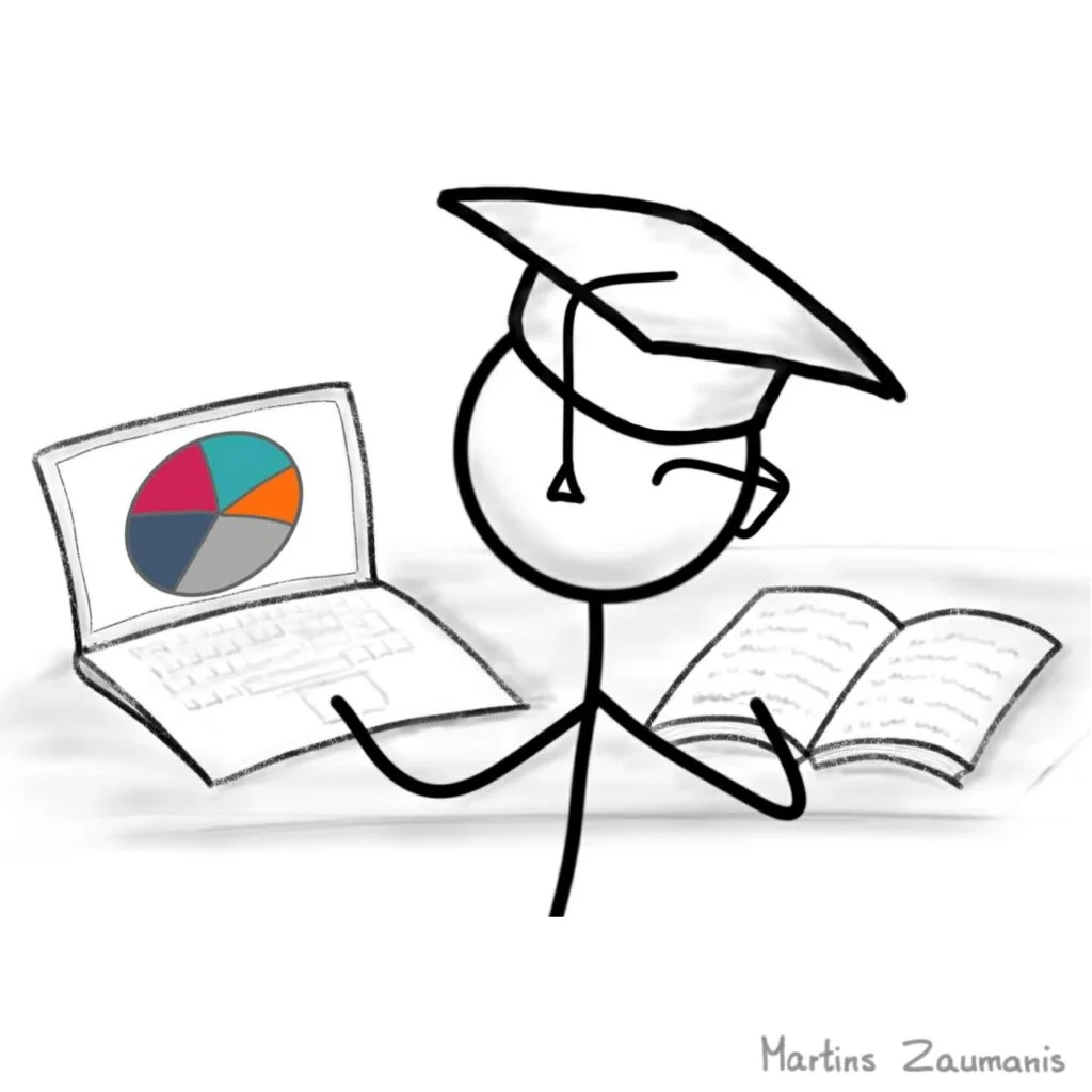
For research papers
Self-explanatory data visualizations and crisp scientific illustrations get research papers noticed and cited.
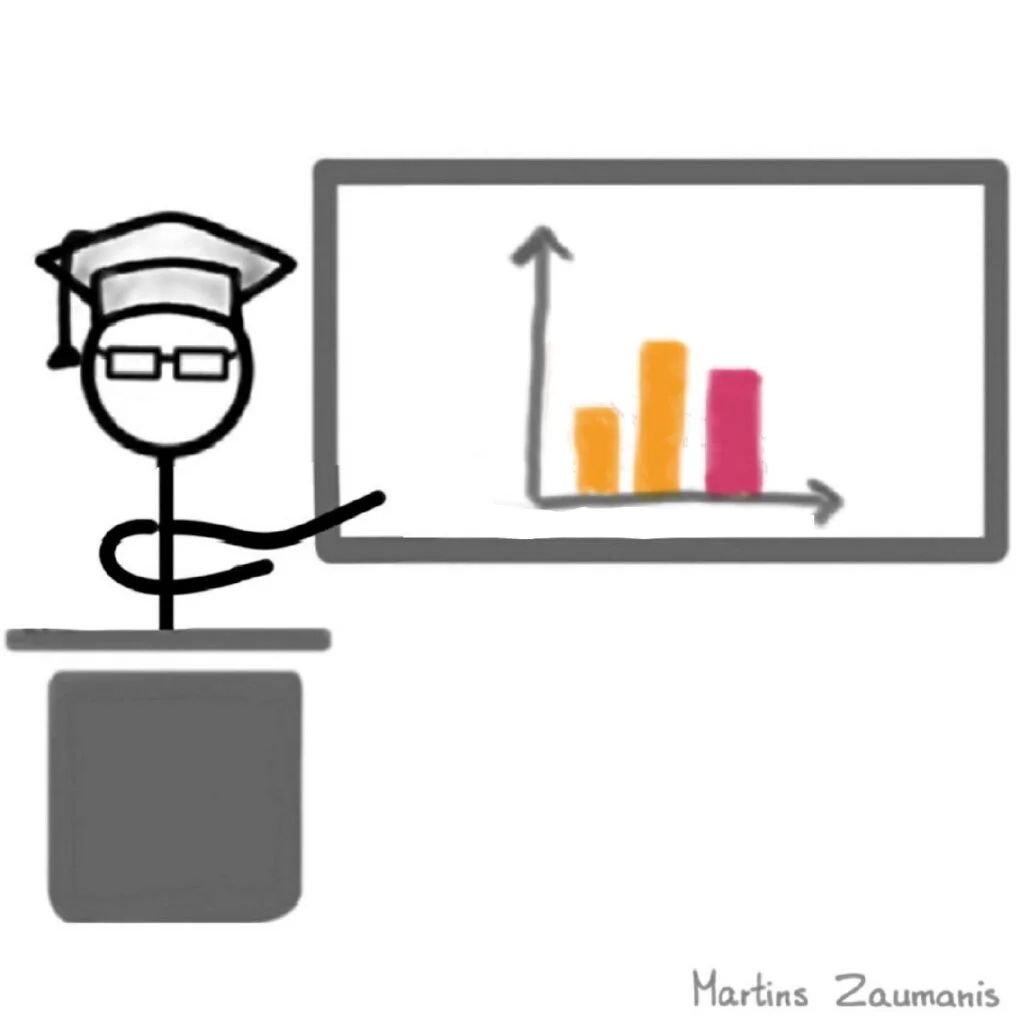
For presentations
Convincing presentation slides and visual poster designs aid in delivering memorable scientific presentations.

For research proposals
Visualization of scientific ideas helps scientists like you write research proposals that get funded.
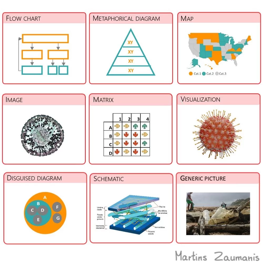
By reading the book, you will learn:
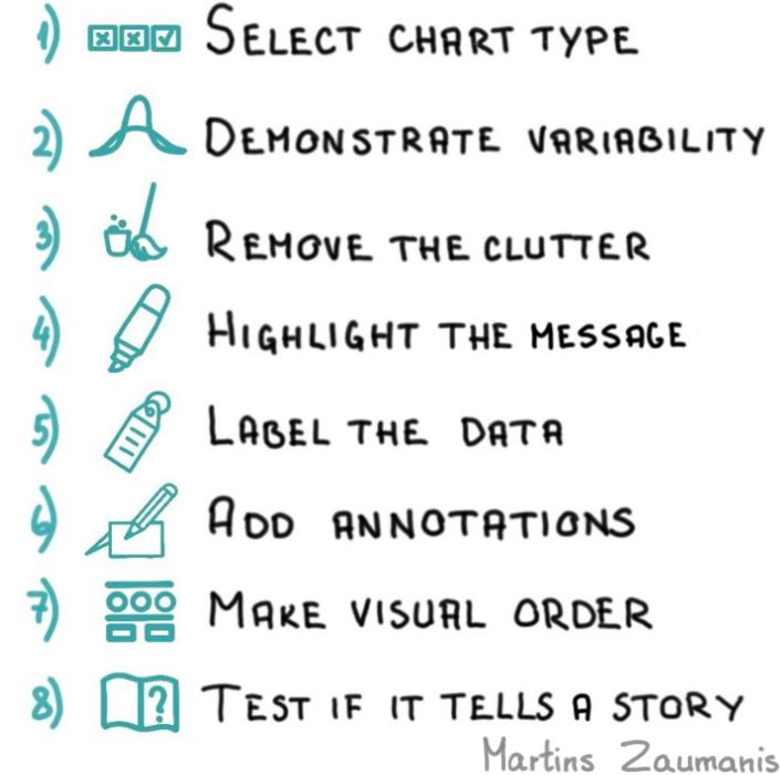
- Eight progressions for turning research data into convincing charts
- Graphical features to use for converting scientific concepts into self-explanatory diagrams and scientific illustrations
- How mastering visualization principles will help you write better research papers
Available on Amazon
- Amazon USA
- Amazon Germany
- Amazon UK
- Amazon France
- Amazon Italy
- Amazon Spain
- Amazon India
- Amazon Netherlands
- Amazon Australia
- …and any other Amazon country
What’s included with the book purchase
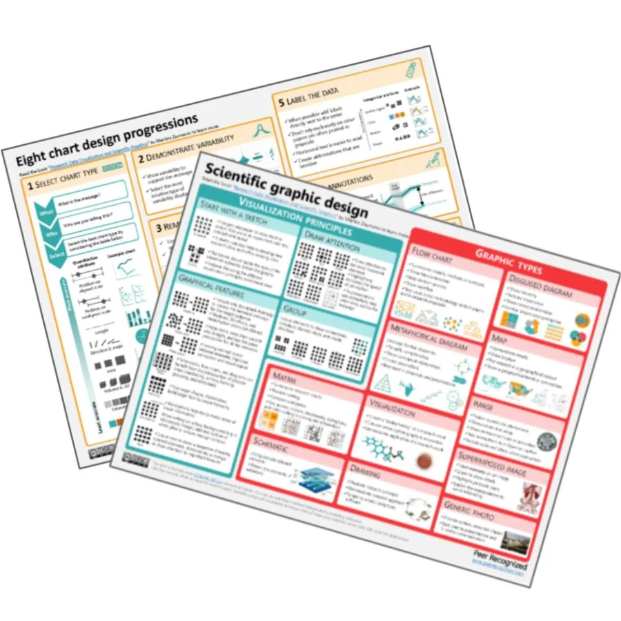
Two cheat sheets
Download two high-resolution printable cheat sheets that summarize the advice from this book. Pin them to your office wall and rely on them as a guide whenever you are creating a chart or a graphic.
Data visualization tools
Use the right tools for the right job. I provide a comparison of different data visualization apps and useful online resources via a complementary website.
Scientific graphic design tools
Charcoal is certainly one way to create scientific illustrations, but there are other tools available. A list of the best tools for creating graphics is included at the accompanying online resource.
What readers say
5.0 out of 5.0 stars
This book is a great review of the basic principles of data visualization best practice. This small book covered all the same principles as a graduate level course I took in data viz last year in a fraction of the space.
Rudy Pinkham, Master’s student at WPI, Worcerster
5.0 out of 5.0 stars
Unlike other dataviz books, this one is written specifically for scientists by a scientist. I have read other books on the topic and this one resonated with me the most because of the many examples from research papers, proposals and conference presentations.
Maria Castellano, M.A. in Computational Linguistics, San Jose State University
5.0 out of 5.0 stars
There is a lot to learn…things that you cannot find by randomly searching keywords on google.
Abbas Solouki, PhD student at the University of Bologna, Italy
5.0 out of 5.0 stars
The book is well written, practical and even a bit funny at times. It offers a straightforward path to creating data visualizations and provides great examples for what to do and, importantly, what not to do when creating charts.
Michael Luber, Computer science specialist, Germany
A closer look into the book
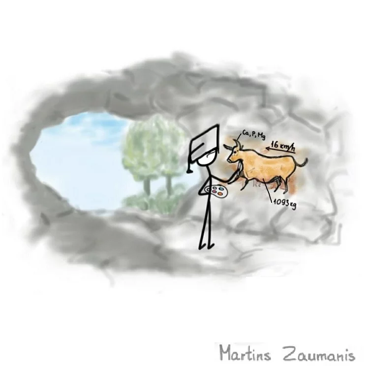
The straightforward approaches presented in this book are designed with efficiency in mind. By reviewing a variety of good and bad examples, you will learn how to include scientific visualization in your research communication routine. No artistic talent required.
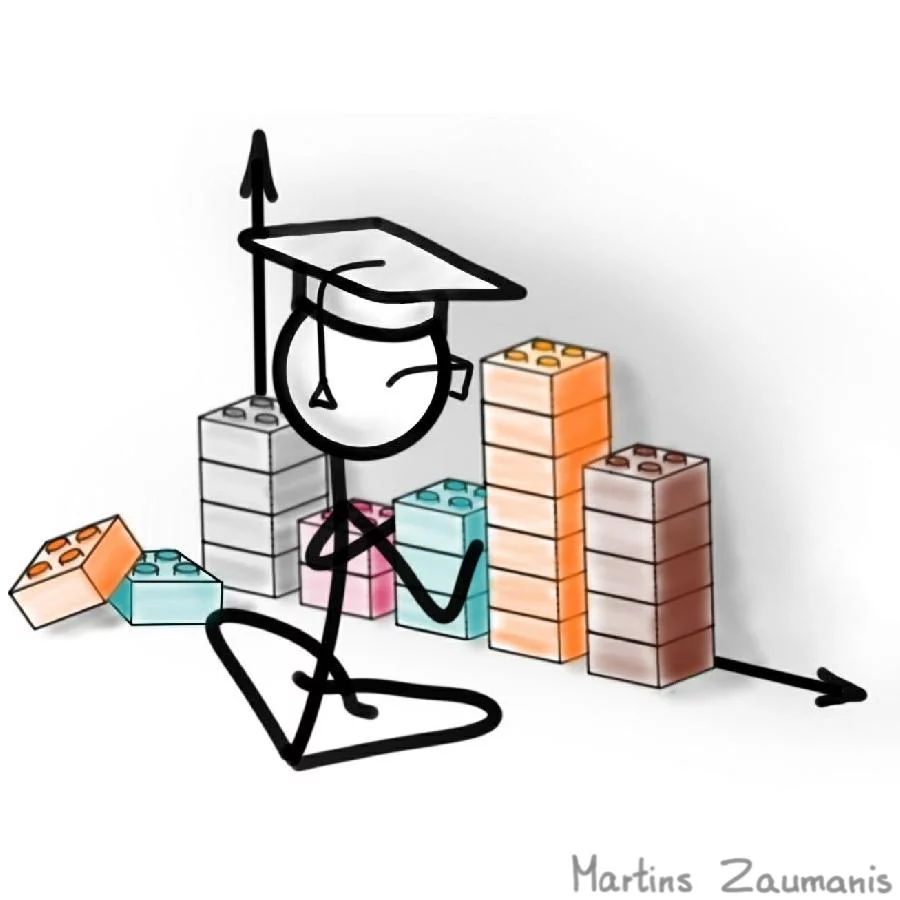
I am obsessed with finding ways to communicate science visually. For example, during the last half a year of my PhD, I spent almost every evening hand-drawing my research just so that I could present a memorable TEDx talk. But I don’t expect you to become obsessed. Quite the opposite: I developed an approach that will allow you to create great charts and graphics without taking away time from what you love most – research.
Here is what to expect from each of the two parts of the book.
Part I: Eight data visualization progressions
Data visualization allows you to understand the research results yourself and then be able to convincingly communicate them to others – but only if it’s done right. In the first part of the book, you will learn eight bulletproof progressions for turning research data into charts that tell a story.
Part II: Designing scientific graphics
Graphics are often more efficient than words when explaining research methods and displaying scientific concepts. In the second part of the book you will see both good and bad examples of graphics and learn eleven visual features for creating convincing graphics.
Look inside the book
Why should you trust me?
Back when I was about six years old, in the era predating Photoshop, Canva, and supersized plotters, my mother would hand draw a poster announcing each basketball game for our town’s team. I vividly remember the large pieces of paper spread across our kitchen floor on which she would write beautiful letters and numbers with her calligraphy tools. I would sit beside her, mesmerized by how the flow of ink would magically turn into letters and shapes. I’d always have my own piece of paper, on which I’d try to make my own posters.

Fast forward 30 years and not much has changed in that regard. As a researcher, I still need to visually display information, but with the advantage that I can use a PC instead of ink and calligraphy pens. Every single data visualization, scientific illustration, and diagram has to be clear, informative, as well as grab attention – just like the posters that my mom used to make.
I can happily spend hours, even days thinking about ways to best visualize data from my research. Heck, in the final half a year of my PhD studies, I spent almost every evening hand-drawing different items from my research just so that I could better explain the topic in presentations. You can see those drawings in my TEDx talk.
Creating scientific graphics and visualizations may be my hobby, but I am fully aware that for most researchers the prospect generates the same amount of enthusiasm as preparing one’s tax return. My goal with this book is not to make you love scientific visualization as much as I do.
Instead, I want to convince you that you don’t need a mysterious artistic gene to create scientific visualizations. Visually expressing one’s research is not just for those whose first childhood memories are designing posters. You are not trying to become the next Leonardo da Vinci. All you need to do is convincingly communicate the concepts and results of your research to others. It is not artistisc talent that you seek; it’s effective communication skills. What you need is function, not form.

With this book, I want to remove the illusive mystique from scientific visualization. I will show you which visualization principles can best help you communicate your research more convincingly. And because good communication skills lead to other benefits, such as increasing citation count, collaboration opportunities, and approved research proposals, it might even allow you to become a better scientist.
The problem is that, even if you trust me that anyone can learn scientific visualization skills, acquiring them still takes time. Being a scientist myself, I know that you have a hundred other priorities, including writing papers, doing experiments, preparing research proposals and drinking beer. And I respect that. To make sure you can fit visualization skills into your routine, I am not going to bore you with theory and endless pages of background. Instead, I offer you a clear step-by-step guide in each of the two parts of this book – creating data visualizations and designing scientific graphics. To make your life even easier, you will find a link to download a summary sheet at the end of each of the two parts of this book. This will allow you to remember the steps without ever needing to open this book again.
The Peer Recognized book series
Eventually, there will be six books in the Peer Recognized book series, each of which will focus on one of the primary academic communication skills that will help to build an academic career. As you can see in the figure, the books are arranged in a sequence that reflects the needs at the different stages in an academic career. Depending on your career stage, choose which one to read.
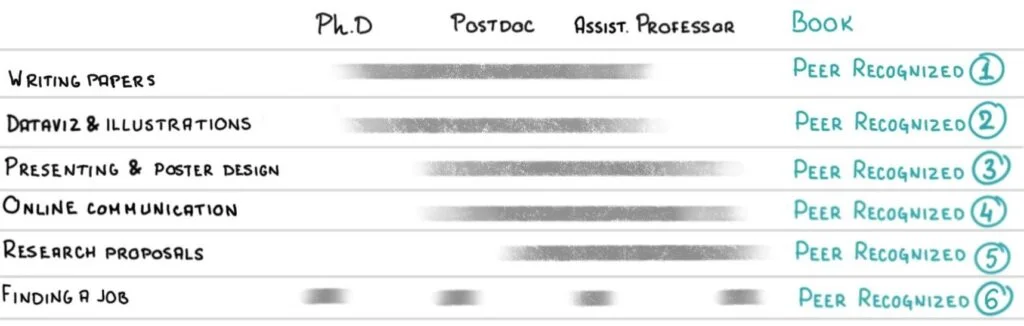
You already saw what to expect from the second Peer Recognized book. Here is more information about the other five books in the series:
- Peer Recognized 1: Writing an impactful research paper
- Peer Recognized 2: Graphics and scientific illustrations
- Peer Recognized 3: Presenting and poster design
- Peer Recognized 4: Online communication
- Peer Recognized 5: Writing research proposals
- Peer Recognized 6: Job Search