
CREATE DATA VISUALIZATIONS THAT TELL A STORY
In this online crash course, you will learn to efficiently visualize research data using a proven eight-step approach.
Convincing data charts will help your research papers stand out and make your presentations memorable.
Convert information into knowledge
Turn browsers of your research papers into readers
Give your research a chance to make an impact
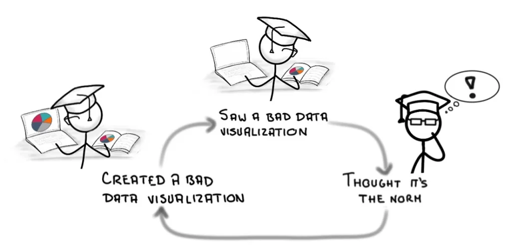
Unfortunately, scientists rarely receive any training in data visualization. Instead, we typically look at the charts used in other research papers and simply follow suit.
Well guess what! Most of the authors of these charts didn’t have understanding of effective data visualization practices either.
…and so the perpetual cycle of infamously bad charts continues…
That is why I created the Research Data Visualization Crash Course
In this interactive online course, I will guide you through an eight-progression approach to converting research data into charts that educate, clarify, and tell a story.
This is NOT a course on “which button do I click to change the chart type.” That’s easy and I am sure you can already do that.
Instead, from the plethora of available options, you’ll learn WHY you should choose one chart type over another.
But selecting the chart is only the the first out of the 8 chart progressions. The remaining 7 progressions will show you how to tell a story with research data.
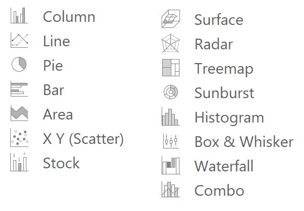
The 8 Chart Design Progressions
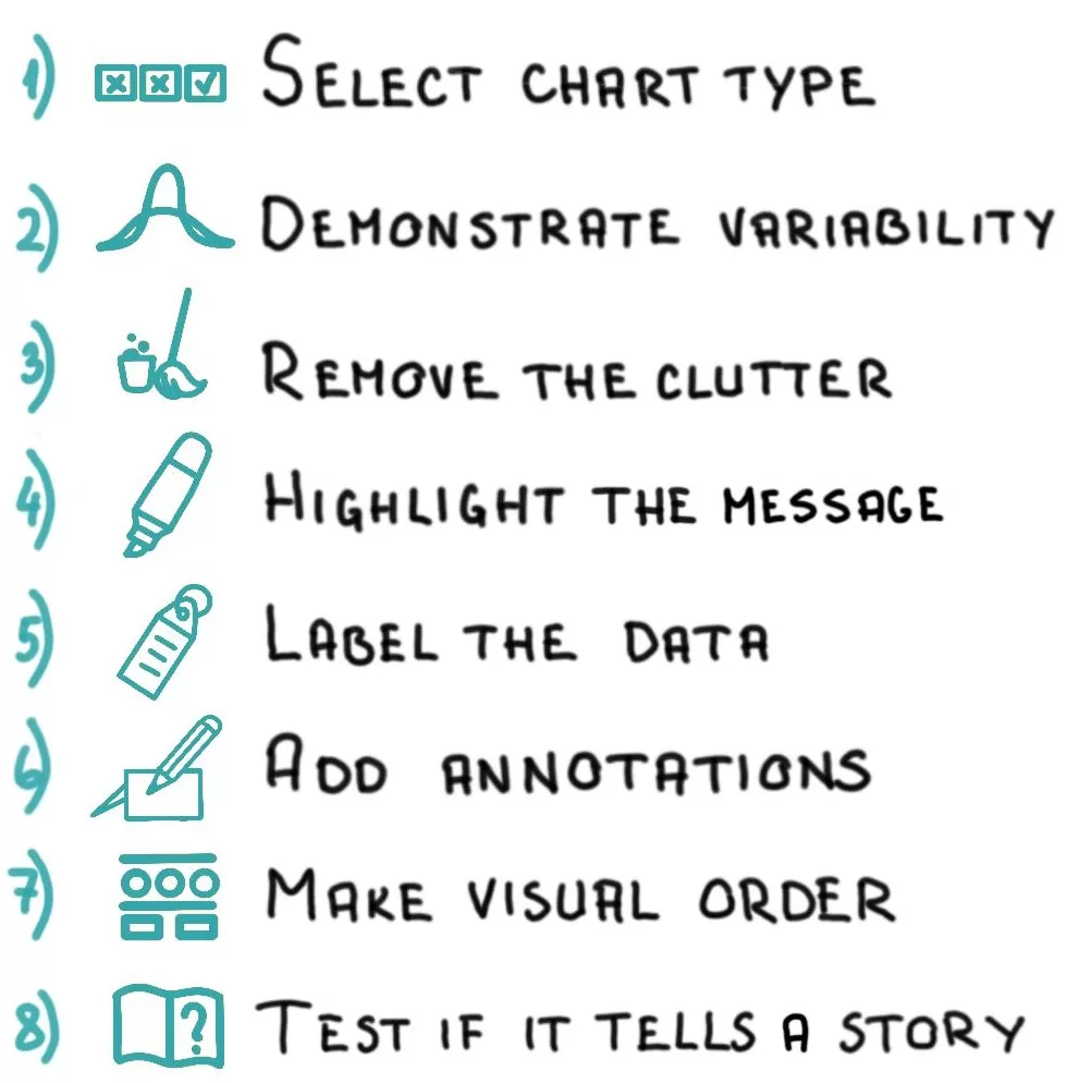
- The progressions offer a systematic approach to creating data visualizations. No talent required.
- Having a system means you can avoid the stress of guessing whether you did the right thing.
- These progressions are universal and can be applied to any type of data or communication activity.
You will be able to use the data visualization skills…

…to write more impactful research papers
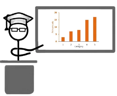
…to give memorable scientific presentations

…to create convincing research posters

…to secure research funding
Masterfully communicating data through visualizations will help your papers gain more citations and your presentations attract more attention. The snowball effect of this exposure could even lead to increased research funding.
Most importantly, clear communication of your research results will give you a chance to make an impact with your research.
During this data visualization online course, you will advance through the 8 chart design progressions

select the chart type
A visualization can help make sense of research data, but only if you choose the right chart type. In the first progression, you will learn how to determine the chart’s message using the Core Message Worksheet. Based on this, you’ll apply a research-based approach to select the appropriate chart, depending on your data and audience.

Demonstrate variability
We all know about the error bars, but in some cases they can hide important information. In the 2nd progression you will learn how to accurately demonstrate statistical variability in your charts.

Remove the clutter
In the 3rd progression, you will see how to increase the “data-to-ink ratio” of your charts. This will ensure you have the freedom to guide the viewer’s attention in the following progressions.

Highlight the message
Now that the clutter is gone, you can add elements demonstrating the chart’s meaning. In this 4th step, you will see how to place emphasis using color, proximity, enclosure, connection, size, and motion.

Label the data
It is no rocket science, but well-placed data labels will make it just a little easier for the viewers to understand your chart. In this progression, you will learn small but useful hacks for data labeling.

Add annotations
The right text, placed strategically, can bring a chart to life. In the sixth progression, you will learn how to make charts more self-explanatory by adding annotations.

Make visual order
No one may notice this effort, but that is precisely the point. In the seventh progression, you will ensure the chart is clean and well-organized so that the focus remains on the data, not the design.

Test if the chart tells a story
In the final progression, you will see how to determine if the chart actually tells the story you intended to tell. If it does not, you can return to any of the previous progressions to make adjustments. The complementary chart review checklist will assist you in this process.
The best part? You will become efficient.
You’ll learn to quickly move through the 8 progressions with every data visualization you create.
This will make you efficient and keep the visualization process stress-free.
Think of the 8 progressions as the blueprint for creating DATA VISUALIZATIONS THAT TELL A STORY
Research Data Visualization Crash Course trailer
Principles of the Research Data Visualization Crash Course
Advice + Practice = Results
The Data Visualization Crash Course is built around practical assignments. In each progression, you’ll start by learning the content through bite-sized videos. Then, you’ll take quizzes, play simulation games, and most importantly, practice creating data visualizations.
You’ll even create charts using your own data during the course.
These practice assignments will help you fully master the eight chart design progressions, so you can confidently use the system in the future.


It’s Called A “Crash course” for a reason
I’m a scientist myself, so I know you’re busy. That’s why I designed this course to be short but packed with actionable advice.
We’ll focus on practice over theory and getting results quickly rather than trying to learn everything about data visualization.
In short, the course follows the Pareto principle: get 80% of the results with 20% of the effort.
efficiency is the priority
To make it easy to apply what you’ve learned in the course, you’ll get extra materials, including the Chart Design Cheat Sheet, Core Message Worksheet, and Review Checklist.
You’ll also receive a summary of the course content in an eBook, so you won’t need to spend time re-watching the videos.
Most importantly, the eight chart design progressions will make you efficient at visualizing your research data. Time after time.


